MARk: Visualizations with D3.js
Nov 16, 2021 by Georgi Nikolov | 3442 views
Detecting suspicious or malicious activity in a network is not a trivial task. In recent years the attacks perpetrated have grown in sophistication and frequency. For this reason a new detection tool was developed, in the form of the Multi Agent Ranking framework (MARk). MARk sets the groundwork for the implementation of large scale detection and ranking systems through the implementation of a distributed storage in conjuncture with highly specialized, stand-alone detector agents. The detector agents are responsible for analyzing specific predefined characteristics and producing a report of any suspicious activity encountered.
When analyzing any encountered activity in a network, it is of vital importance to have a clear and concise reporting available, so any expert reviewing the findings can quickly and precisely extract any vital information. This can be hindered if the analyst needs to comb through large quantity of texts and numbers. That is why almost all Security Operation Centers (SOC) use novel visualization techniques and apply the methodology of “Detection through Visualization”.
Detection Through Visualization
Intrusions and targeted attacks in network infrastructures become more and more specialized and difficult to discern and there is a growing concern that some will pass unnoticed. There is a great need for better capabilities which can aid analysts in promptly detecting and analyzing such intrusions. This can be achieved through the use of visualizations- the use of graphical representations of network activity or specific characteristics of given elements in a network.
One way MARk achieves this is by letting detector agents generated specialized figures which present the information in different ways. With the latest versions of MARk, it is now posible to review the generated figures directly through the web interface.
Examples of figures generated by detector agents are shown below in Figure 1 and Figure 2.
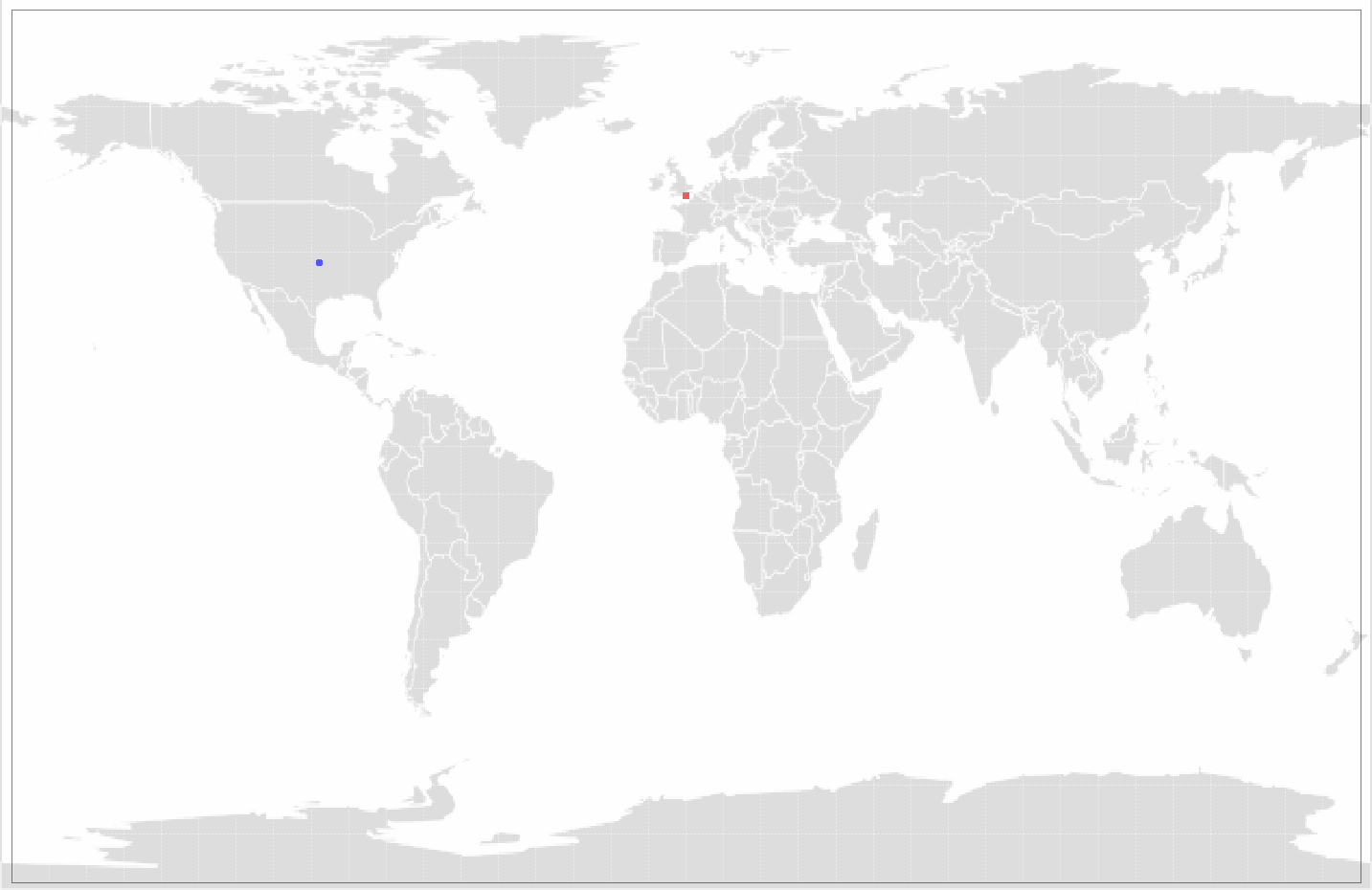
Figure 1 shows the output of the Geo Outlier detector agent, which will try and determine the origin of a specific server a client connected to. By using available free online sources, such as GEO ID, we can get the approximative coordinates of a given server that hosts a domain we are interested in. It is important to note that some domains may be hosted on multiple servers for robustness so we may encounter multiple connections to the same domain connect to different real-life servers in different countries. In this case we are more interested in outliers- servers that are too far away from the normally accepted spreading of possible servers where a domain can be hosted.
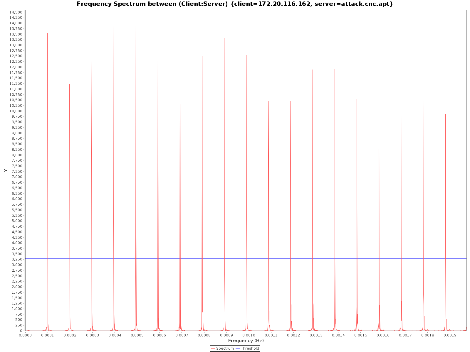
Figure 2 shows the output of the Frequency detector agent. This detector agent is responsible for analyzing the frequency with which a client sends HTTP requests to a certain server and find out if there is a certain periodicity to this frequency. This is done through the construction of the frequency spectrum, shown in Figure 2.
The D3.js library
Another way of getting more clarity in the way agents generate evidence and produce their ranking lists, is through the use of the D3.js visualization library. By default, each agent generated an overview of all generated evidences and ranks them depending on score, as displayed in Figure 3.
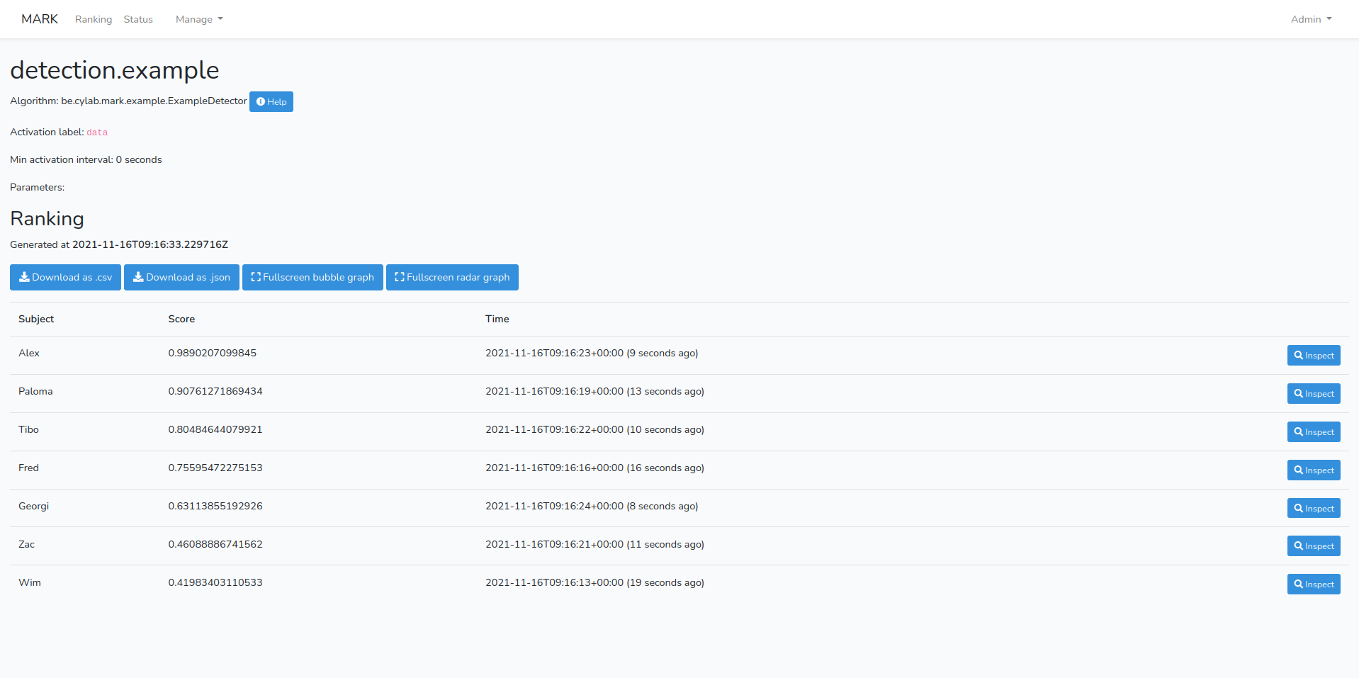
From here an analyst can review the parameters used by the detector agent and inspect individual entries. But what if we want to compare entries or have a clear idea of which entries are of importance, without having to go through the whole list and reading individual scores? In the case of the example given in Figure 3, we have a short list of only seven entries, but in a real-world situation, this list will be much longer, with thousand of entries with different scores and names.
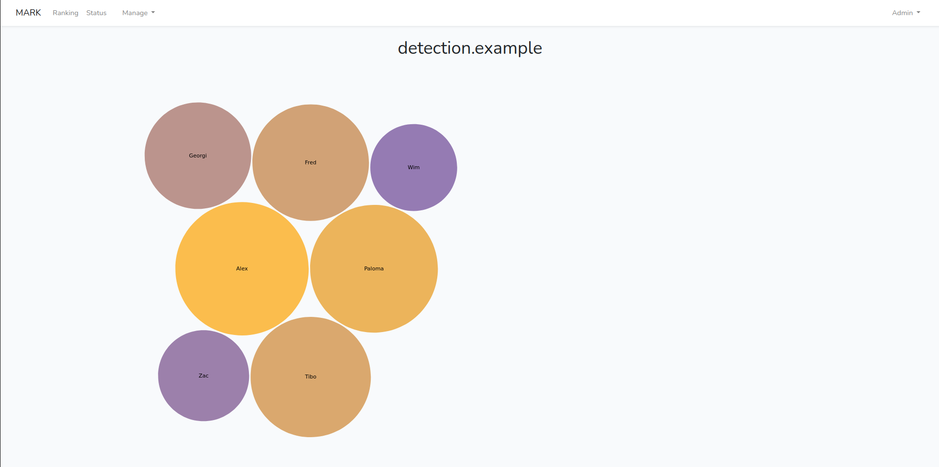
To quickly get an overview of the different evidences produced and how they compare to each other, we can use the Bubble Graph visualization displayed in Figure 4. Already through the use of color, size and positioning, we can quickly understand which evidences are of major importance and focus our attention on them. In this specific example, bigger circles with brighter colors signify a higher score. These same bubbles will also be positioned more central in the visualization, with lower scored evidences positioned on the outskirts. From here we can click on a given bubble and inspect a specific evidence.
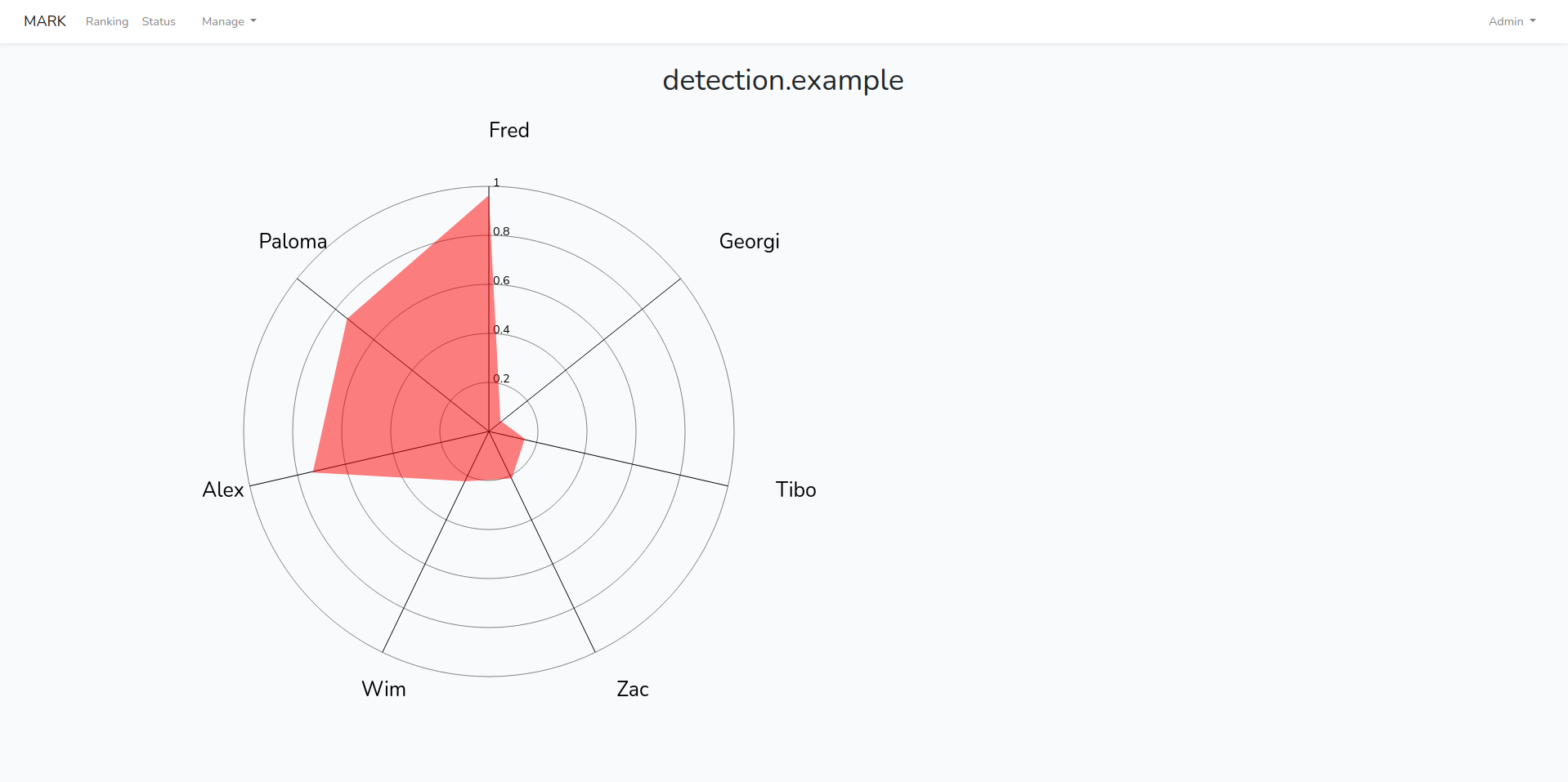
Another example of such visualizations is the Radar Chart shown in Figure 5. Here again the goal is that the eye is directly drawn to the highest rated evidence and how it compares to other produced evidences. This type of visualization can also serve to analyze the detector agent’s score distribution and gain insight in its reliability. It is again possible to inspect a specific evidence by clicking on it and reviewing the report generated by the agent.
Conclusion
What was shown here are just the first steps in the implementation of our visualization tools. We aim to expand and refine how information is reported and visualized, aiding the analysts in the vital task of detecting malicious activities and rooting them out of their networks.
It is important to note that there are tools available that do this already, such as Kibana and Power BI, but our goal is not to compete with them, but to offer a quick and simple tool to review data through our own web interface, alongside the possibility to directly access agent’s reports and any other vital information. Afterwards, it is up to the user to decide if they want to use other tools for further visualization and analysis, as MARk is intended to be easily deployed as stand-alone or incorporated into existing SOC infrastructures, working alone or alongside other detection tools.
This blog post is licensed under
CC BY-SA 4.0


